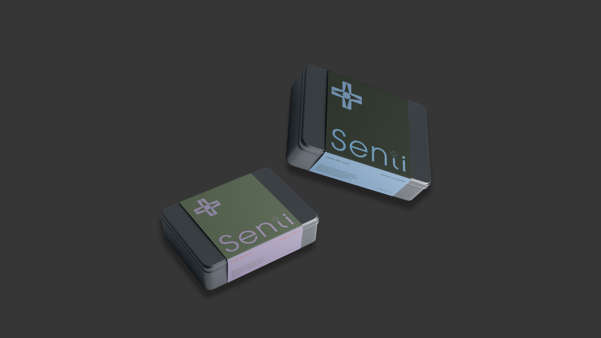
The goal was to position a brand of first aid medical kits, originally designed by and for the military, for success in the B2C market in Europe. The target audience includes active travelers, adventurers, humanitarians, journalists, and others going to remote locations.
A brand strategy, positioning, name, and identity were required.
About

Name
Senti, short for 'sentinel'—one who watches and guards—also evokes 'sentir,' connecting to the emotions and experiences of adventure and exploration.
It’s short, memorable, friendly, and to the point, while still containing the letters 'ST,' preserving a link to the original name. The name is also applicable to the other business branches.
Meaning
The lines of the letter 't' allow for the easy integration of the cross symbol, instantly linking it to the world of medicine and first aid.
But there’s also a more subtle meaning hidden in the final two letters. If you look closely, you might notice a doctor (the 't') talking to a patient (the 'i')—face to face, symbolizing one human helping another.
The symbol is a minimalist blend of a cross, representing the product's core focus on first aid, and a compass, symbolizing adventure, exploration, and a free spirit.


